I love marketing. And I love email. But my favorite kind of marketing are the simple, elegant concepts that check boxes and help you reach goals. The stuff that is more clear and smart than sophisticated and complex.
This idea from AWeber is absolutely one of those.
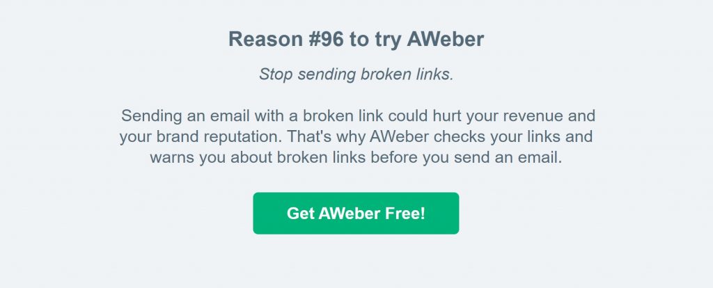
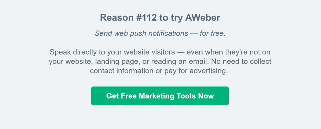
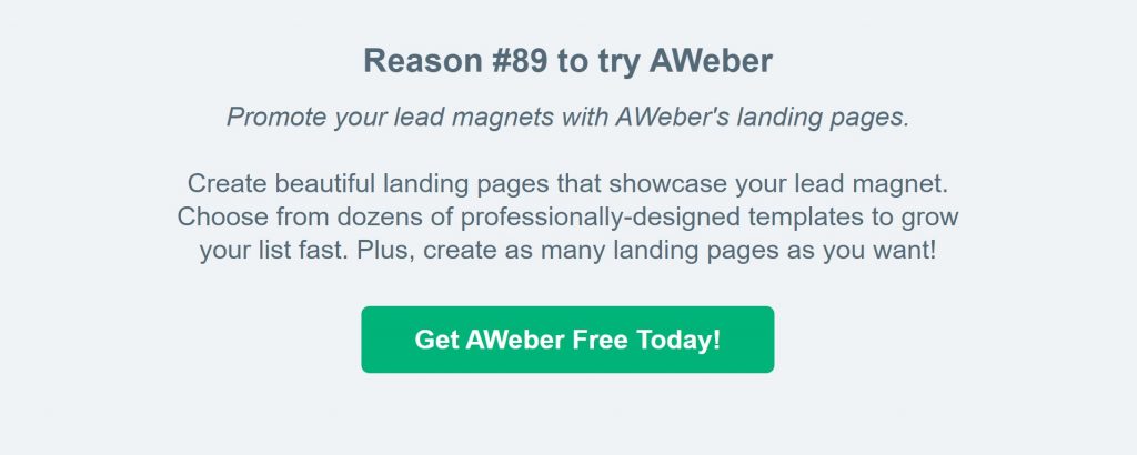
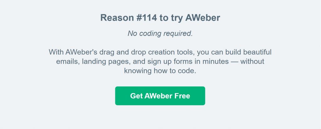
Because if you sign up for AWeber's newsletter (and you definitely should) at the bottom of every campaign will be a little gray area that starts with the same word - Reason - and ends with some simple reminder of why you may want to give their platform a try.


As a marketer, it's always hard to both keep hitting the core message (who you are and what you do) and support that with your 3-4 key selling points (those differentiators and market-built features) but also have space in your marketing calendar and copy to hit all those other things without making your messages too verbose.
Things like how you check for broken links.
Or how you can do push notifications.
Or your new landing page feature.
Or that drag and drop editor you're so proud of.
You're already sending emails and those emails have a footer, so I love how AWeber created a simple space to ensure all that "other stuff" has a moment to get in front of more folks' eyes on a regular basis.
Such a great strategy.


 Gregg Blanchard September 13, 2021